 However, such a situation is afoot this week in Sweden and the story goes back eighty years.
Way back in 1929, British sculptor and typographer Eric Gill was commissioned to create a clean sans-serif typeface for the London and North Eastern Railway. After much labor on the project, the result was an uncluttered, practical and ultimately timeless font that the Martin Mull lookalike modestly named after himself: Gill Sans.
Gill Sans appears equally clear on directional signs as it does in a dense paragraph of magazine text. Its clarity is a result of its forms being inspired by the proportions found in ancient Roman characters. Gill made huge circular shapes out of his capital letters like C, G and O. The capital M is a perfect square with an imaginary X in the middle, dividing the box into four equal triangles. Sans serif typefaces are generally more compact and efficient with the space they use, but Gill Sans is wide open.
Sometimes glorified (or derided) as "the English Helvetica," the versatile typeface is still in exceptionally widespread use today.
 Gill Sans can be seen in the logos of Benetton, Tommy Hilfiger, the BBC and eHarmony, in the film graphics of Toy Story and Ferris Bueller's Day Off, and as the title font on Edward Young's classic two-tone cover designs for Penguin Books. Not least, it is one of the fonts that comes packaged with Mac OS X, making it a staple on millions of desktops.
Like Helvetica, its lazy overuse has resulted in some of the same backlash that Helvetica enjoys. I have to confess to you that I've used it quite recently, however begrudgingly. I didn't want to use it. I don't really like it that much, but for the job I was working on, it worked. That's all graphic designers need, really, something that works and compliments its context.
Another example of the font's usefulness, cleanliness and popularity has resulted in the controversy that is currently making news in Sweden. This is an example of a design that looks nice but its context makes all the difference.
Gill Sans is the logo typeface for Rädda Barnen ("Save the Children"), a non-governmental organization based in Sweden that "fights for children's rights [and works to] deliver immediate and lasting improvements to children’s lives worldwide." They are a massive organization, promoting noble aspirations and, to be sure, they are relentless in their efforts to help children in dozens of countries.
That's why it is such a sad and unfortunate coincidence that Eric Gill, designer of the Gill Sans typeface, not only abused his own children, but had an incestuous relationship with his sister. If that isn't enough to turn your stomach, he was also up to other sick perversions I don't need to discuss for the purposes of this story. Let's just say his dog couldn't really relax around the house either. Instead of using his dog to pick up girls, this poor animal was being used as the girl.
This bastard Eric Gill was a genuine piece of shit. Hardly the type of character you'd want even remotely associated with your organization, regardless of your line of work.
Oh, and did I mention he was super religious?
 Suffice it to say that the people at Rädda Barnen were shocked about a year ago when they became aware of the history of their logotype's creator. They quickly began taking steps to replace it.
Louise Gauffin at Rädda Barnen told the graphic design magazine CAP & Design this week, "As soon as we heard about it, we began a rebranding project... We felt that we should phase out the font." I should say so.
All this has become public during the past week. When a communications consultant named Per Torberger was watching the Swedish version of Idol recently, he saw a fundraising commercial for Rädda Barnen. He had one of those moments of realization when he saw the logo and typeface together. It made him feel sick.
Torberger wrote about it on his blog, Pers Värld ("Per's World"), and it immediately began lighting up cyberspace.
Quite decisively, Rädda Barnen announced on Monday that they are beginning to phase out the typeface:
"When Save the Children chose Gill Sans as a logo typeface, we did not know of Eric Gill's background. It is something we have become aware of in recent times. We take this issue very seriously and as soon as possible, we will replace the font... We estimate that the work will be completed in 2010. As soon as it is possible in terms of cost, we will change the font."
 The reaction to the change seems overwhelmingly positive, even among people who are not interested in design. Believe it or not, there actually are some people in Sweden who are not interested in the way things look.
This might disgust you even more than anything else you've read here today: I regularly see professionally-made signs and flyers in Stockholm with the Comic Sans font on them. Talk about an offensive typeface!
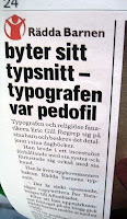
In their reporting on the Rädda Barnen logo situation, the tabloid Aftonbladet referred to Eric Gill in today's paper as a "typographer and religious fanatic... and pedophile." Ah ha, I see. Not only an artist but a true multi-tasker.
Do you think that's what it said on his business card? "Eric Gill: typographer, religious fanatic, pedophile. Please ring London Kensington 4-5-2."
What a shame as well that Gill was such a talented pioneer and whose work has endured the test of time, especially in a field that sees influence come and go many times each year. I guess you can't have it all.
 The Sydsvenskan newspaper in Malmö ran the headline "Save the Children fonts designed by pedophile." That pretty much says it. "The creator of the typeface abused his children."
Pia Högberg, creative director at Stockholm's Infobahn advertising agency is a bit more understanding on her company's blog. "Oops! ... Of all the fonts in the world, they chose the one designed by a man who was a pornographer, had an incestuous relationship with his sister and on top of it all brutalized his own children." Oops indeed.
"An honest mistake," she says, "which unfortunately will become an expensive story for Save the Children. Time and money that should go to their core activities instead."
Högberg gives all the credit to Per Torberger who brought the regrettable dichotomy to the public's attention, starting only with a post on his blog. "Who says the individual doesn't have power?"


This is a very interesting article. I had no idea about Mr. Gill. I design for a non-profit, and must admit to occasionally using this font.
ReplyDeleteIt raises a very interesting question to me... At what point do we need to separate the art from the artist?
If an artist's contribution fills a need, and becomes useful for the common good, can we then justify it's use despite the disgusting proclivities of it's creator?
I mean, are we to examine the lives or every inventor, artist, scientist, and disregard their contributions if we disagree with their morals?
For example, are we so sure the inventor of the harmonica was only blowing instruments? (Sorry to pick on you, Christian Friedrich Ludwig Buschmann)
For this reason, I think this "controversy" is rather absurd, but I do understand the issue. Obviously Mr.Gill was a horrible human. However, I hope this issue arises from the unfortunate coincidence of context, because I rue the day this kind of scrutiny becomes commonplace.
Also, die already, Comic Sans.
A pornographer? Really? Did the person who wrote this actually read any of the diaries in question, or any of Gill's biographies? It doesn't sound like it.
ReplyDeletePersonally, I don't think Gill - especially the ugly bold weight - is especially useful, so I'm glad to see them phase it out for that reason alone.
I hope you're also going to get on people to remove Vivaldi, that noted pornographer, from their hold & elevator music as well. And certainly a number of Swedish museums have paintings by sexual deviants hanging - we should make sure those are removed, as well as library books that might have images by the same people.